INSIGHTS | Vita Papernov
Using Icon Animation to Improve Digital Experience
Who doesn't love a well-designed animated icon? Publishers and product developers alike are using new animation tools to spark a renaissance in digital animation effects for HTML5 and native platforms. But before we get ahead of ourselves in our creative self-indulgence, we need to ask, why do we need icon animation? What are we trying to achieve with it, and how can animation improve the digital experience?
What's the added value of animated icons?
The short answer is: it can add delight and improve comprehension. A well-designed animated icon will contain the right balance of thoughtful messaging and playfulness for the intended digital journey.
Effective icon animation tells a clear and compelling story, appropriately guiding and amplifying the intended digital experience. It helps your digital product spring to life by increasing immersion, appreciation, and ease of use.
Guidelines for Icon Animation
Consider Static and Interactive Icons
Non-interactive icons typically function as a visual UI state indicator, e.g., loading, sending/receiving a message, completing a purchase, etc., or as a content illustration. Static icon animation can draw the user’s attention to the app event/happening and entertain the user during wait times.
Pull to Make Soup, an Open Source Swift UI Library from Yalantis
Interactive icon animation can:
- Function as a mini-demo explaining its purpose and function
- Set up the interaction rhythm for the rest of the experience
- Draw attention to UI changes
- Signal a prompt to user interaction
Find the Right Formula
The first step is to understand what value an animated icon can bring your user base. There are two basic categories of digital animation: delightful and comprehensive. Delightful animation aims to entertain, deepening the user's focus and engagement, adding to overall user satisfaction to increase your customer's bond with your brand.
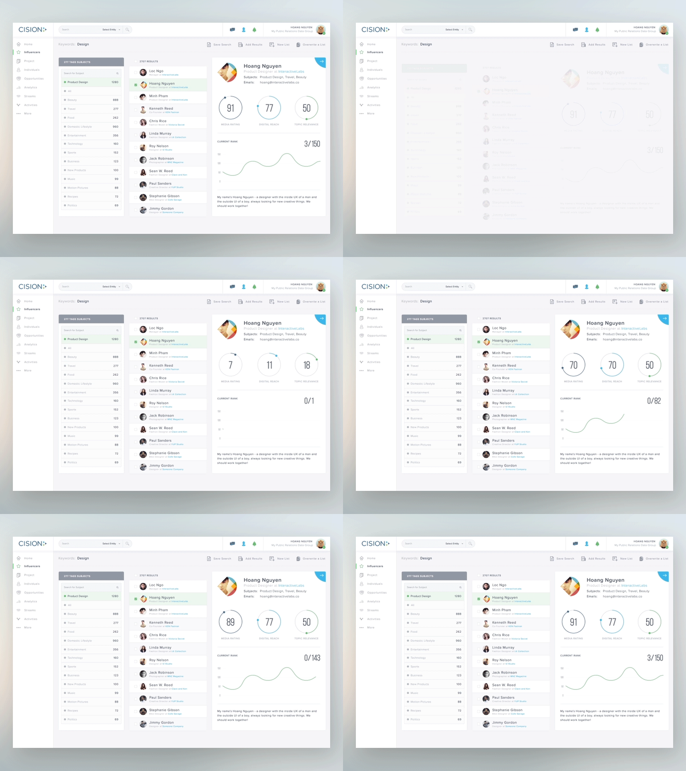
Animating for comprehension should make the digital experience more intuitive to users by showing how things work and, in some cases, even replacing written instructions. Animating for comprehension is mostly used when designing for task-focused interaction. The task and data-intensive dashboard below employs functional animation to facilitate interaction and draw attention to critical content.
Animating primarily for delight is useful for a more relaxed and entertaining digital experience, which presumes the availability of leisure on part of the user. To be successful, your animated icon will need to have the right balance of both and, serve as an effective guide for the user along the digital journey.
Ask the following questions about your intended digital experience.
- Is your project task-focused (e.g., a B2B platform) or play-focused (e.g., a game, etc.)?
- Is the primary role of the animation a) to provide direction or b) to inject fun into the experience?
Convey a Clear Message
Give the human eye sufficient graphical information to make a memorable impression quickly. If the primary goal is to provide functional guidance, the animation content should fairly minimal.
Speed Matters
Optimize your animation speed. Fast motion can be jarring, whereas slow icon motion can feel low-performance and lose the user's attention. 200ms to 500ms is a good starting range. Make animation speed consistent when animating an icon group.
Make Transitions Meaningful
Include enough relevant information in your animation to clearly illustrate the state change. Don’t animate too many elements at once to prevent user distraction. Accelerate and decelerate in a way that makes your icon feel like a seamless part of your UI environment.
New Message transition animation in mobile inbox. Published by UI Movement.com
Animate for Focus
Use animation to draw the user's attention to priority UI areas. Avoid fast and/or high-impact animation outside that intended area to minimize distraction.
When animating an icon series (e.g. a navigation panel during screen load), help the user focus by creating readily-identifiable visual patterns. One approach to give each icon room to shine is by animating in a sequence, i.e., introducing a slight delay (50ms to 200ms) before animating the subsequent icon (browsing left to right, top to bottom).
Create a Smooth-Sailing Experience
Avoid subjecting your users to digital sea-sickness by thinking of your digital environment as subject to a single set of forces loosely reminiscent of real-world physics. Like objects should have similar characteristics, moving alike. The resulting animated fluidity makes your digital environment feel like a seamless whole to foster a harmonious, rewarding experience.
Airbnb App for Android
New Workflow-Enhancing Tools
Emerging tools are simplifying the workflow icon animation for HTML5 and native platforms and enabling a renaissance in graphical effects that have not been seen since the decline of Flash as the go-to platform for animators. Playful and compelling new styles are emerging. CSS3's ever-expanding library allows for easy selection of animation effects, which used to be impossible without the use of JavaScript. A growing number of WYSIWYG libraries such as Animate.css let users select from a multitude of animation effects to auto-generate the necessary CSS.
An After Effects extension called Bodymovin enables users to export animation data as JSON files. An AirBnB tool called Lottie (an iOS, Android, and React Native library) renders this JSON animation data on the web in real time, "and allows native apps to use animations as easily as they use static assets".
With its Sketch2AE, a plugin and AE script, Sketch now allows its artboards to be ported directly into After Effects as layers and editable text with groups and symbols preserved. Shapes are imported as parametric shapes for easy animation.
The Android 8.0 platform is introducing adaptive launcher icons, which support a variety of shapes – along with a range of new visual effects, such as parallax or pulsing – for different device models.
